Brand Refresh
Exploration
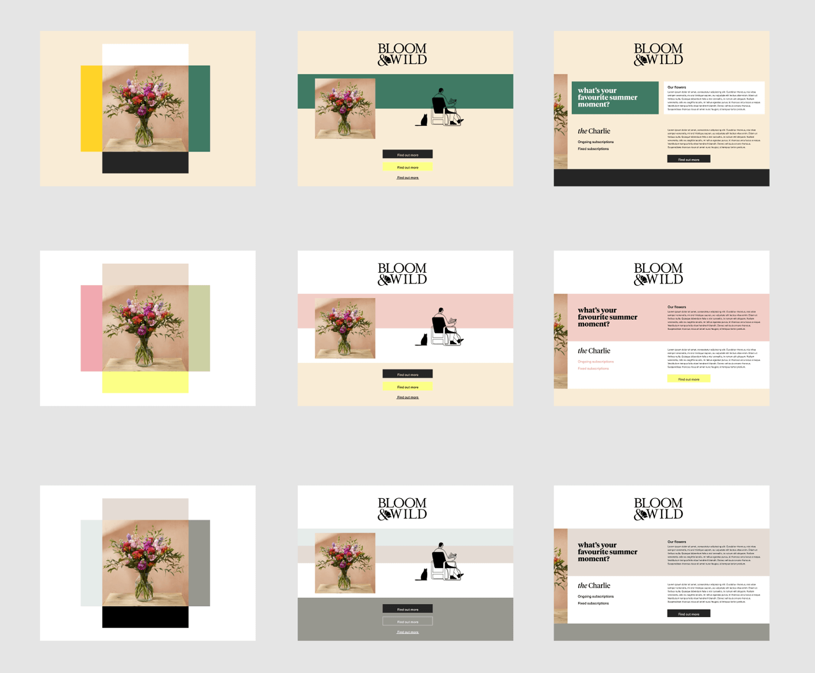
The initial brand direction came from the agency Madre, with the instruction given to test and challenge the principles in our designs.
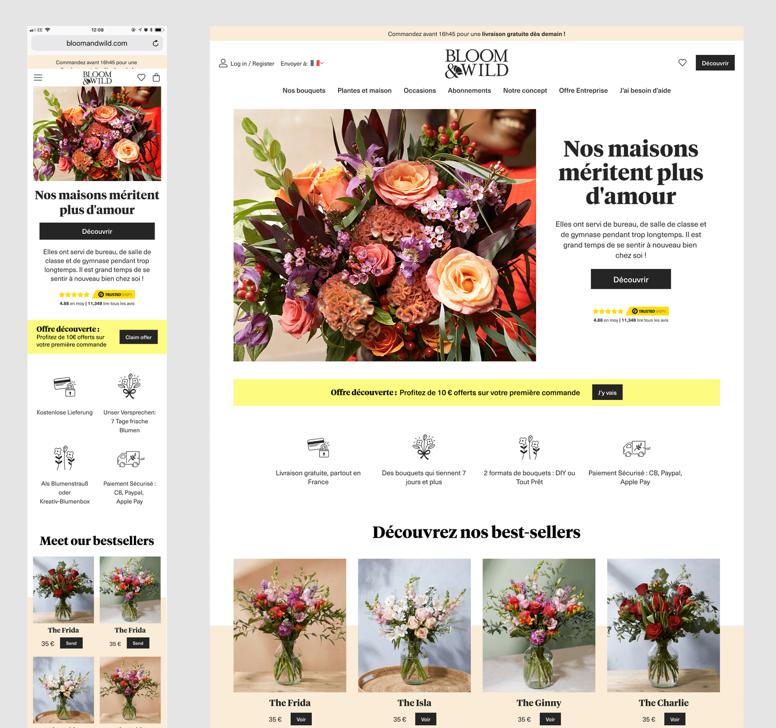
The homepage was the first deliverable we looked at to assess how readily their suggestions translated into digital.
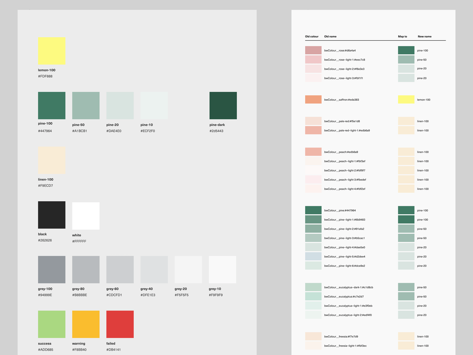
We explored the new colours, text and art direction suggestion to try and achieve the most harmonic relationship between the elements in the space, eventually dropping one of the key suggested colours and ascribing clear meaning to the rest
Consolidation
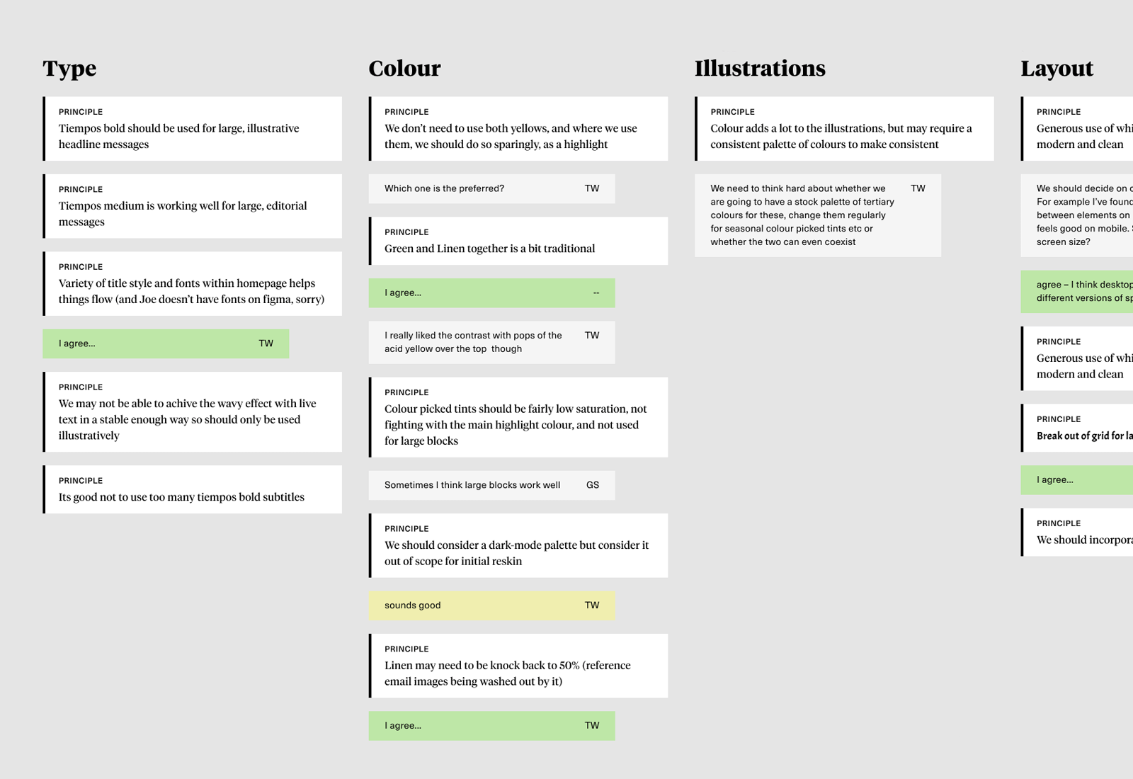
With three digital designers working independently, on interpretations of a dynamic set of guidelines from the agency, there was a danger of each moving in quite different directions and prioritising their own preferences and interpretations of the principles. To bring everyone back into alignment, we created a board where we could describe some of the design principles, and see if we were in agreement with them going forward, or if they needed further discussion.
Application
We wanted to move fast with the application of the rebrand – the associated TVC was due to launch ahead of the incoming Head of Design starting, when the majority of the work would take place. The sites existing CSS had become full of unique styles, and this was a good chance to tidy these up, and associate them to a new, stripped down set of values.
With this in place, we were then able to start revisiting the rest off the sites UI.
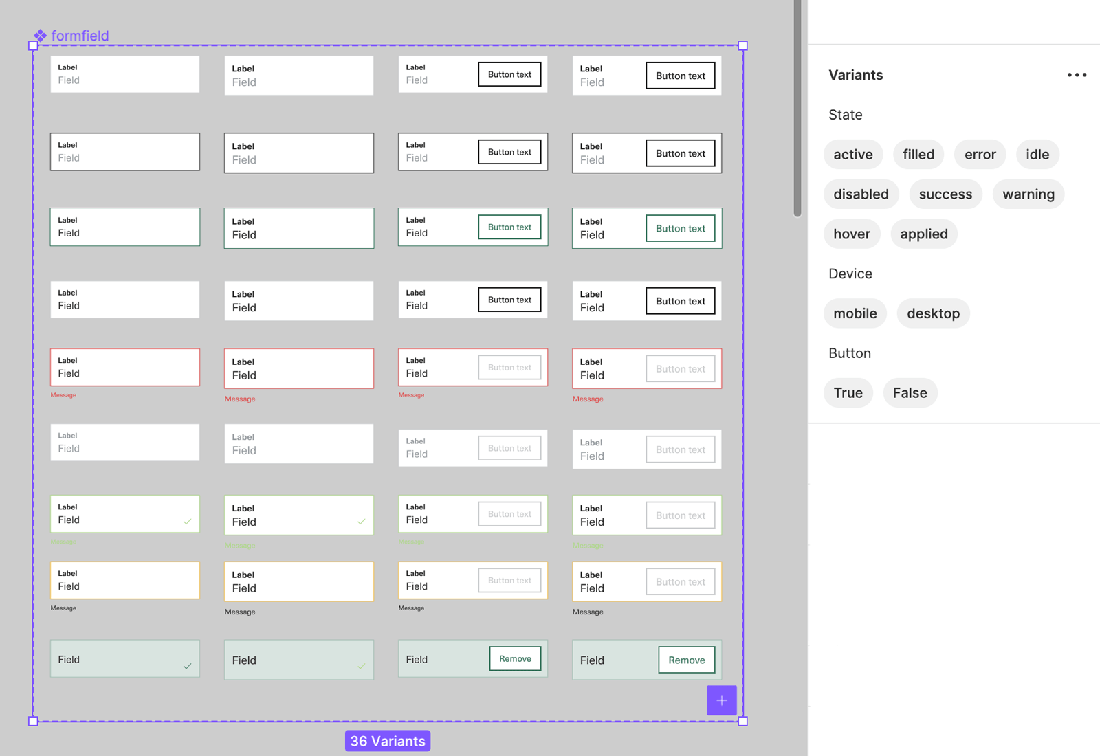
Design System
This was a good opportunity to move the designers from Sketch and Zeplin to Figma. We established conventions around file structure and identifiable common elements such as file cover thumbnails
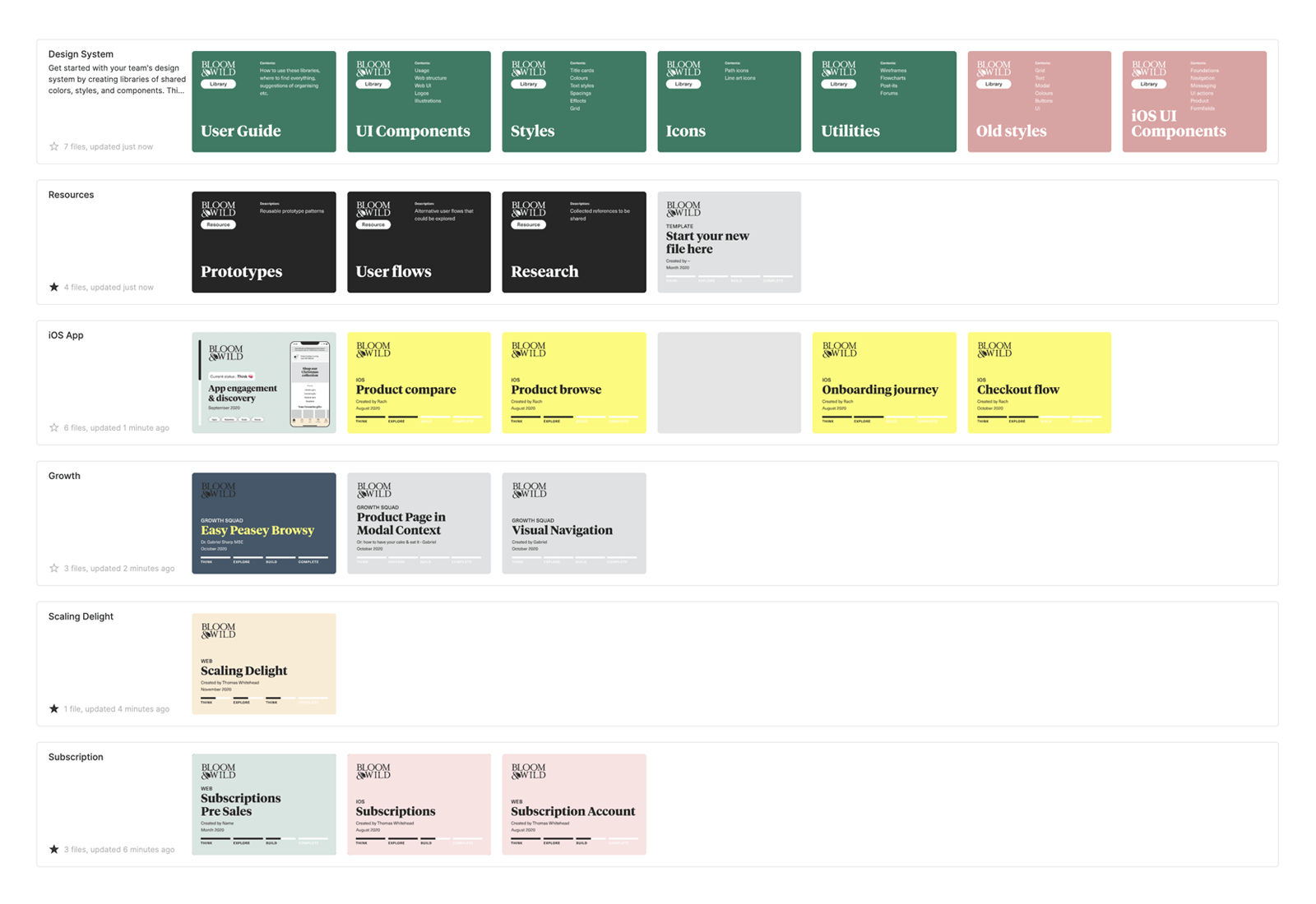
Learning as we worked, we took advantage of new features such as improved auto-layout and variants to build a comprehensive UI library and create the foundations for the design and engineering team to work together on a shared set of components.