EU Brand Localisation
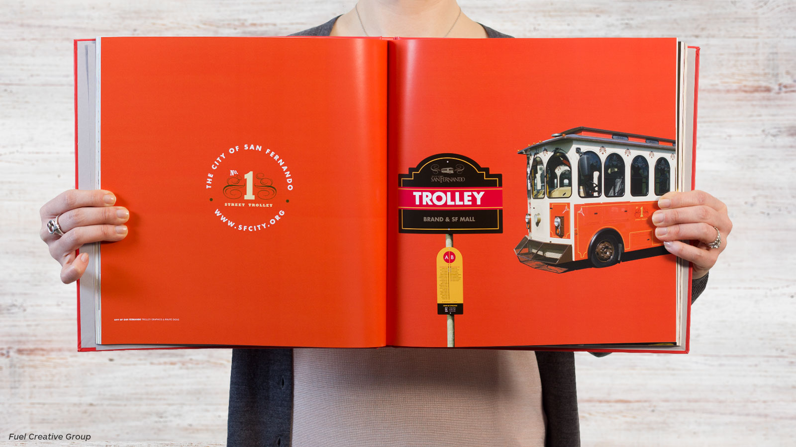
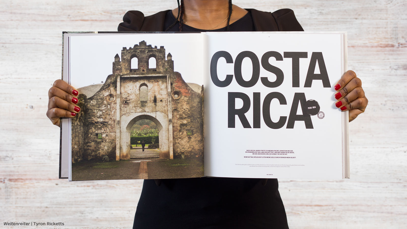
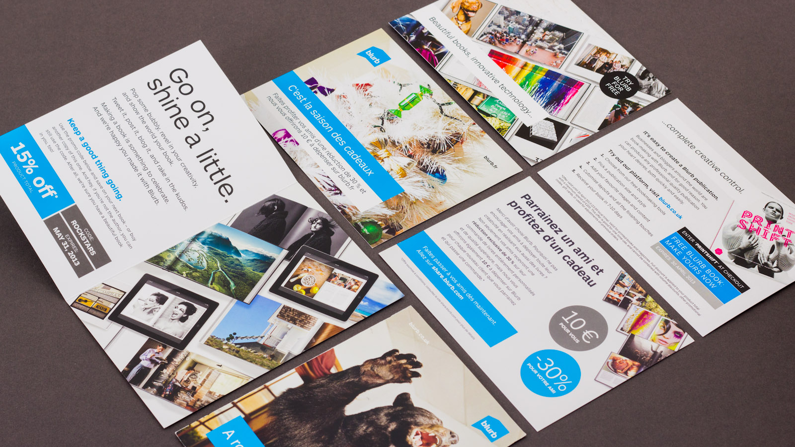
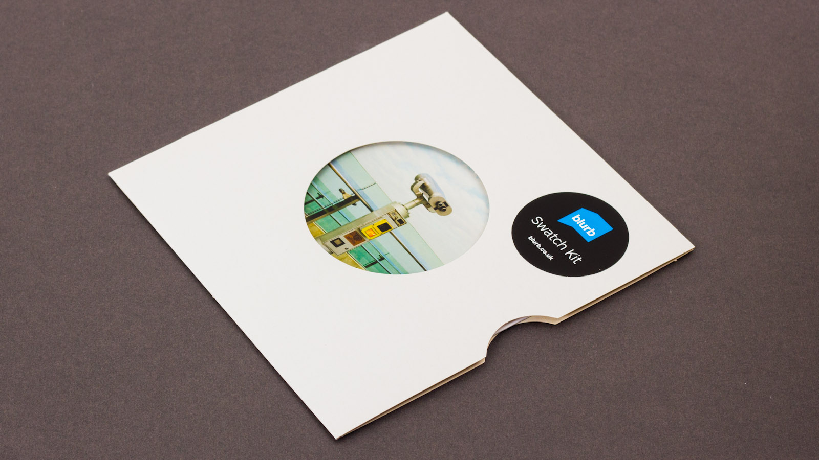
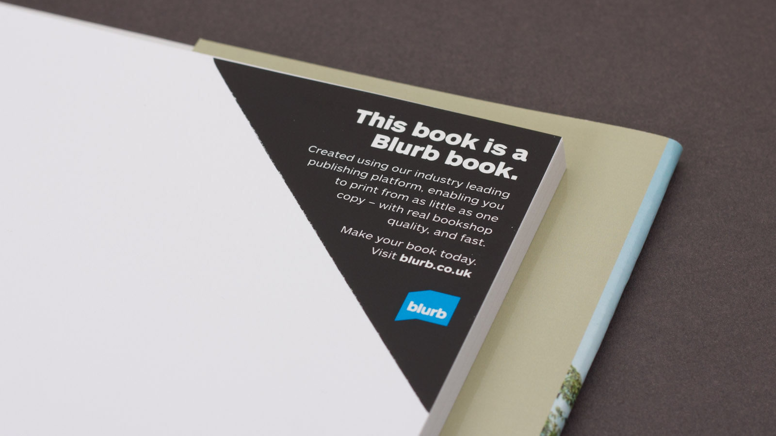
During the first two years, there was a need to establish a strong, consistent brand identity in the new European arm of the business, and to produce material which followed this identity, using consistent typography, colours and photography.
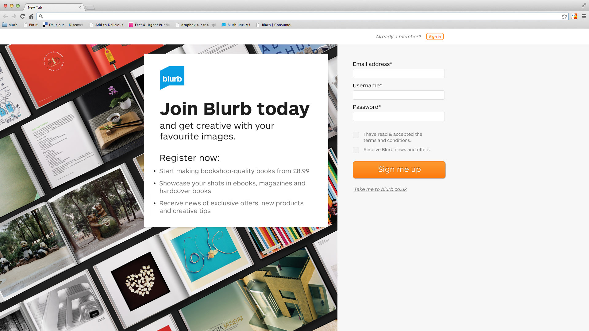
Website refinements
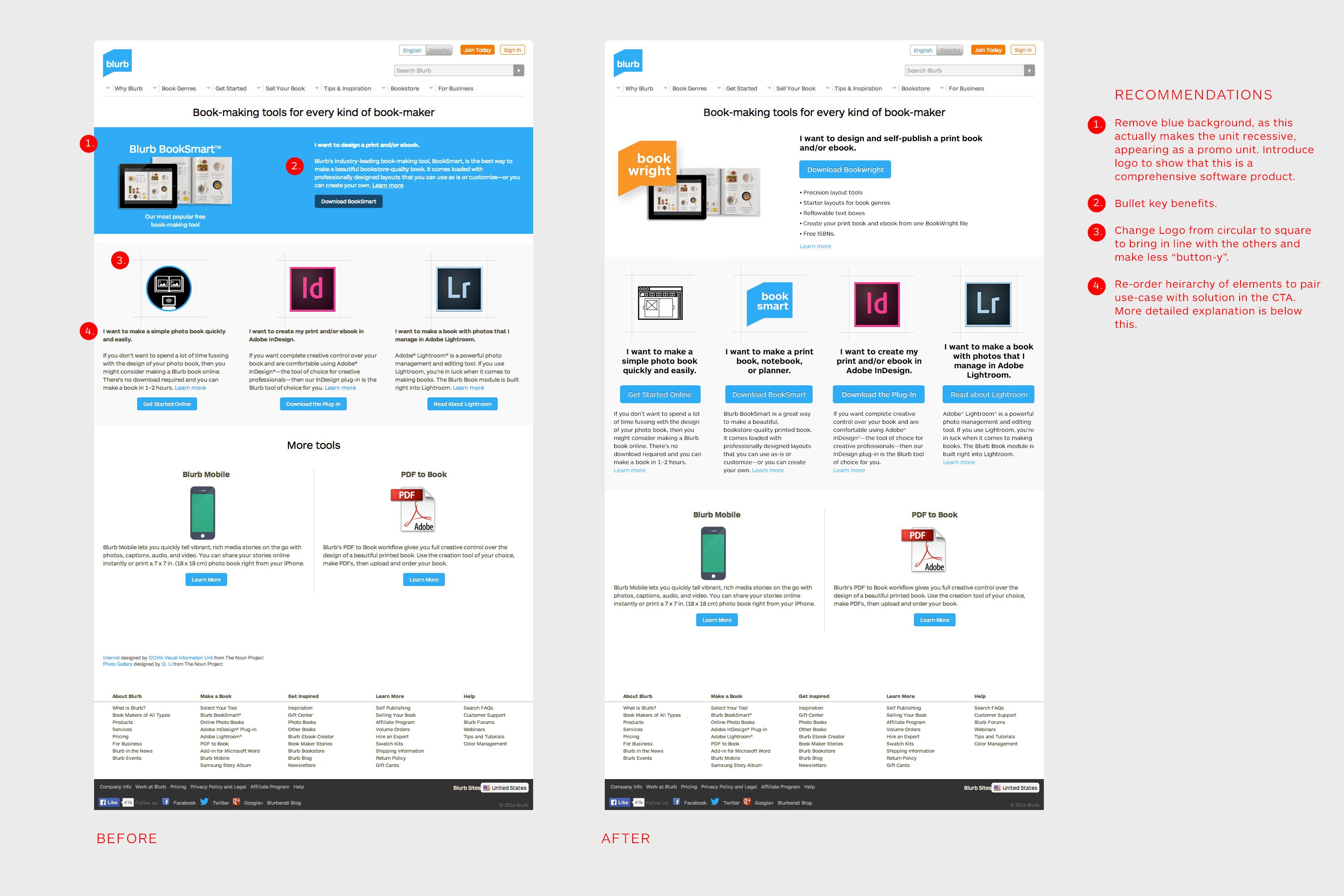
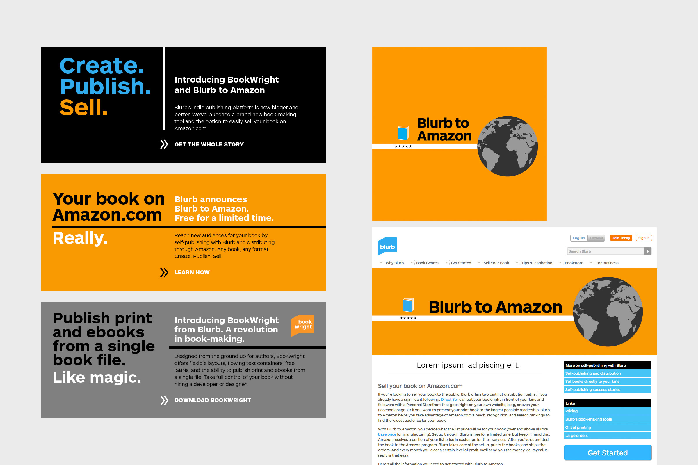
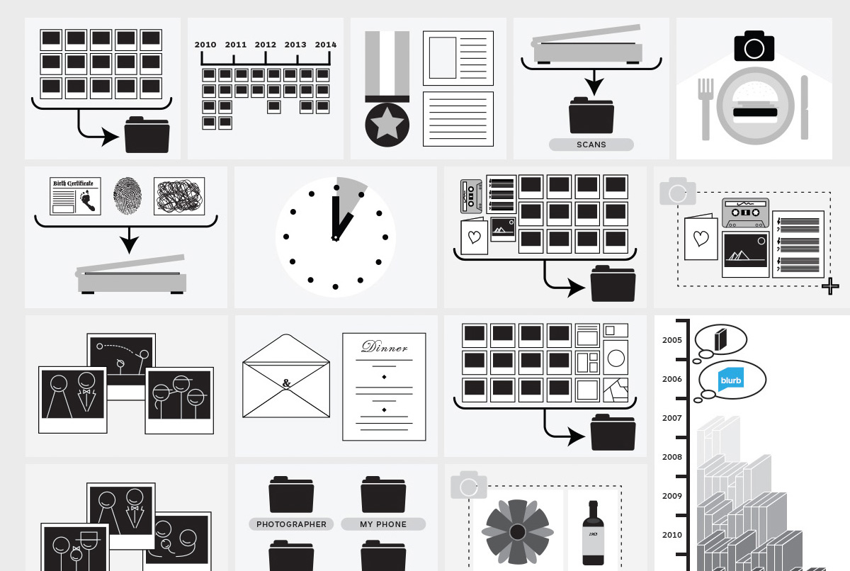
While at Blurb, I produced much of the imagery for the global site, and suggested and implemented a number of UI tweaks to key pages which significantly decreased their bounce rate.
CRM Campaigns
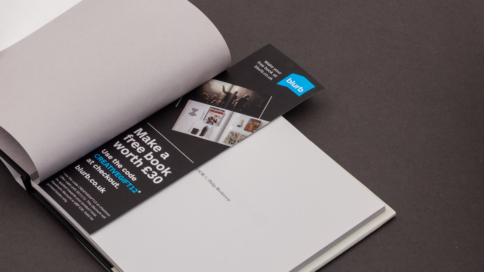
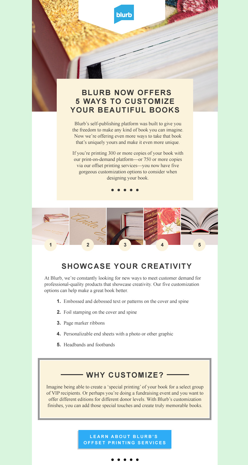
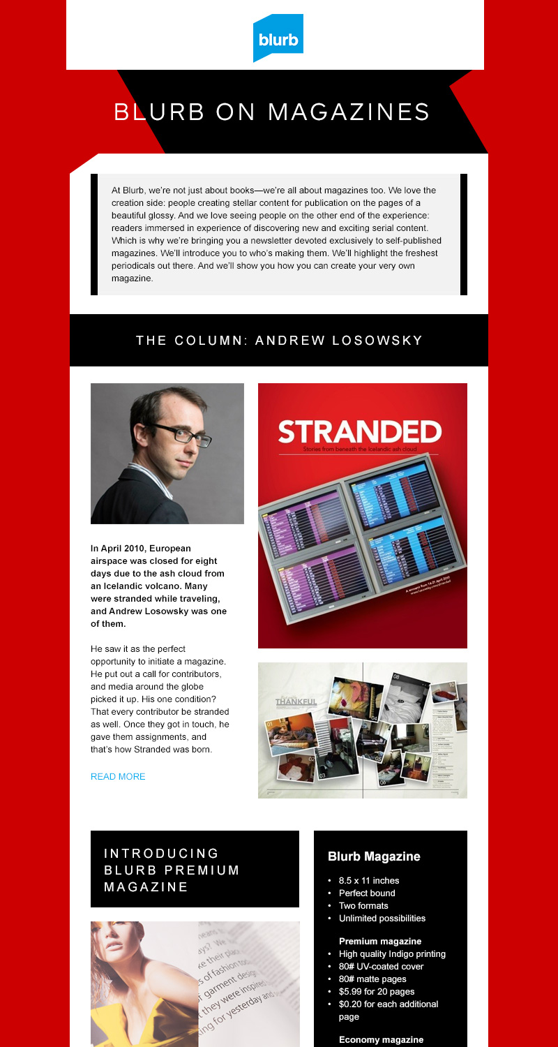
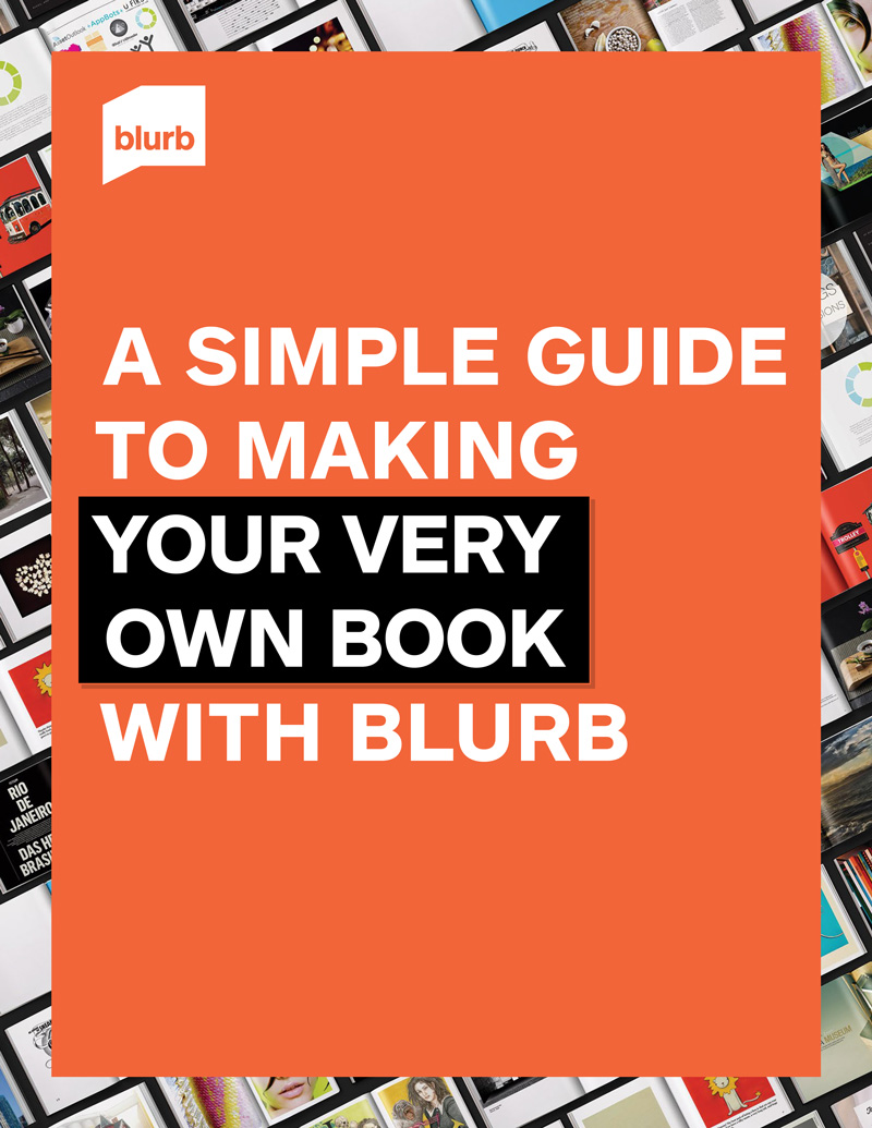
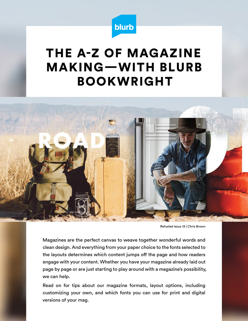
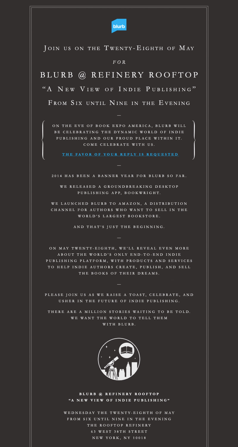
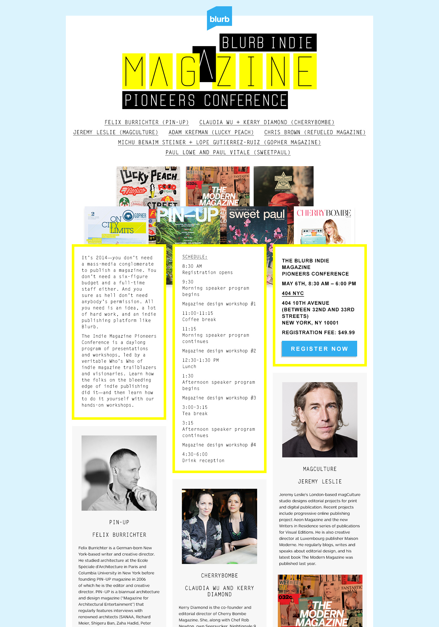
During my time at Blurb, there was a push to move CRM away from heavily discounted offers, towards keeping users engaged with a regularly updated content platform, supporting users with downloadable PDF How-Tos, as well as creating unique one-off offers and promotions.
Nation of Storytellers campaign
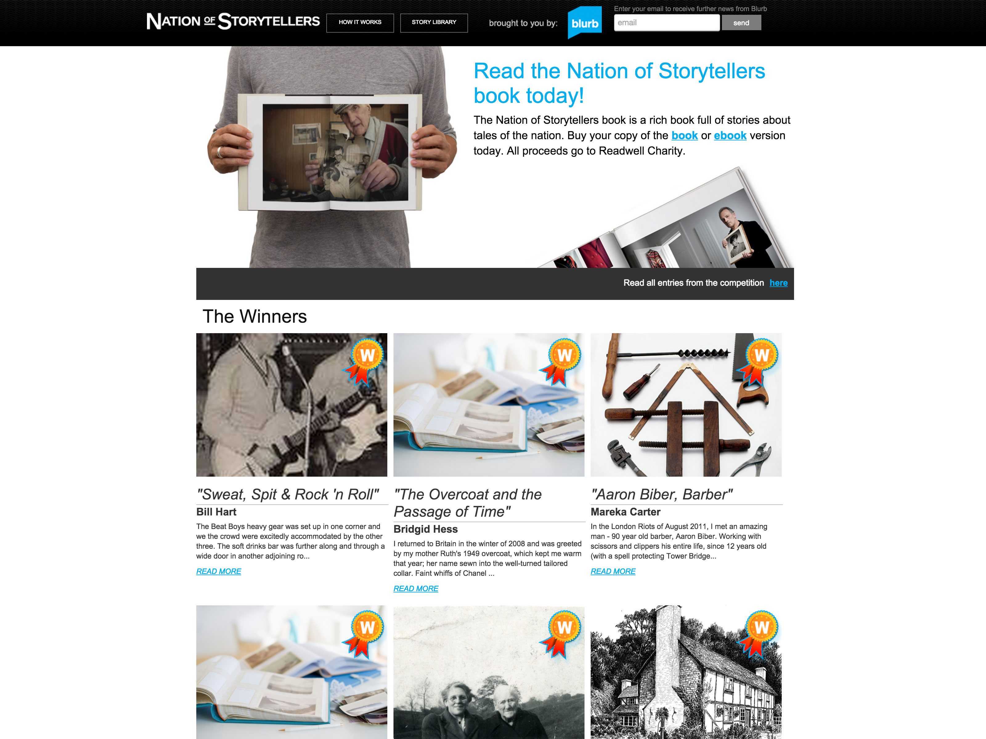
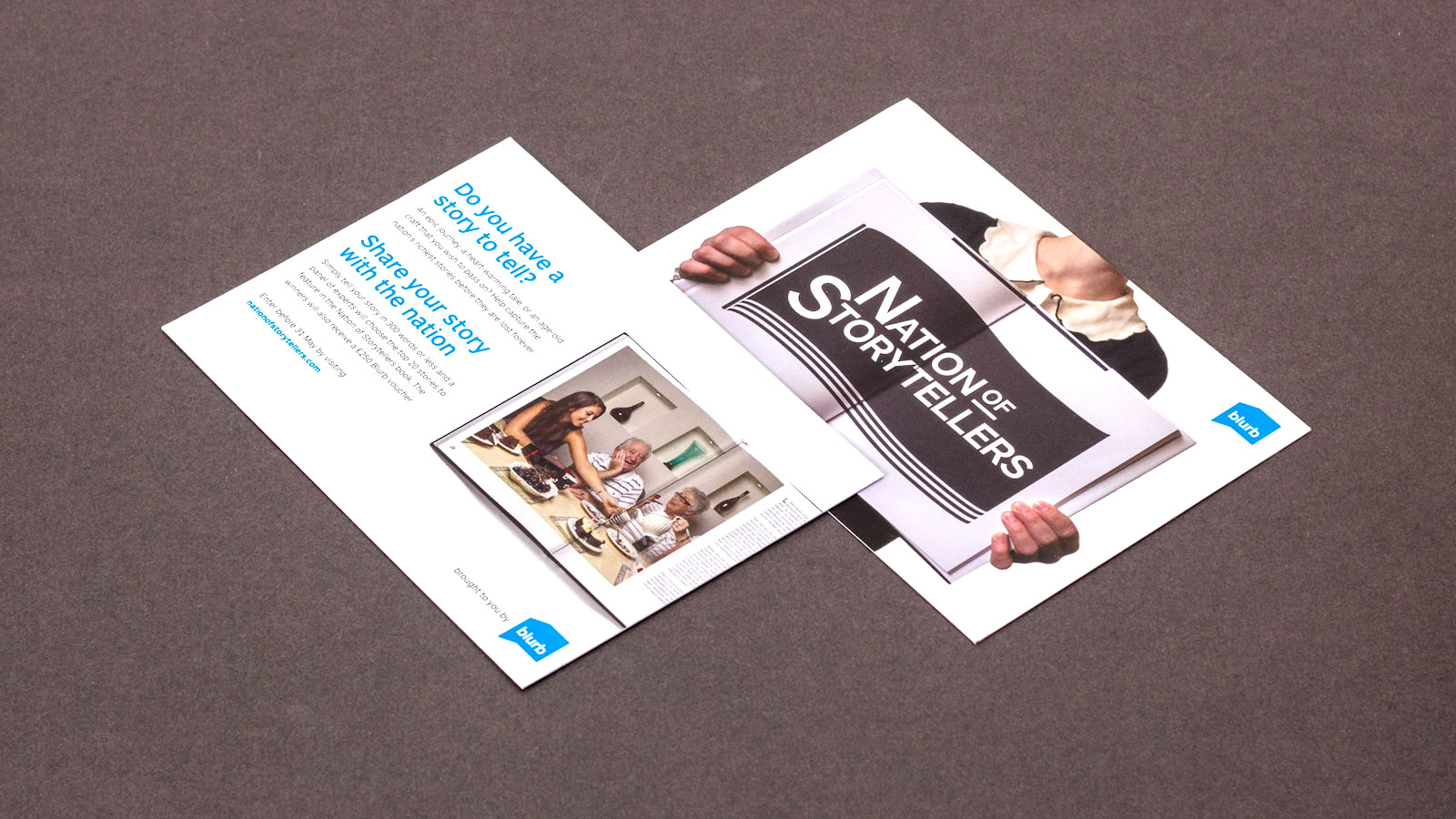
This Campaign was carried out in UK in 2012, and was supported by a lot of PR activity. The aim was to encourage people to think about recording the stories that might otherwise be lost to future generations. I provided the branding, directed the UX and supplied designs for a content platform that would allow users to simply upload their stories, that would be entered in a competition to be professionally photographed and compiled into a book.
Coffee and Quill Campaign
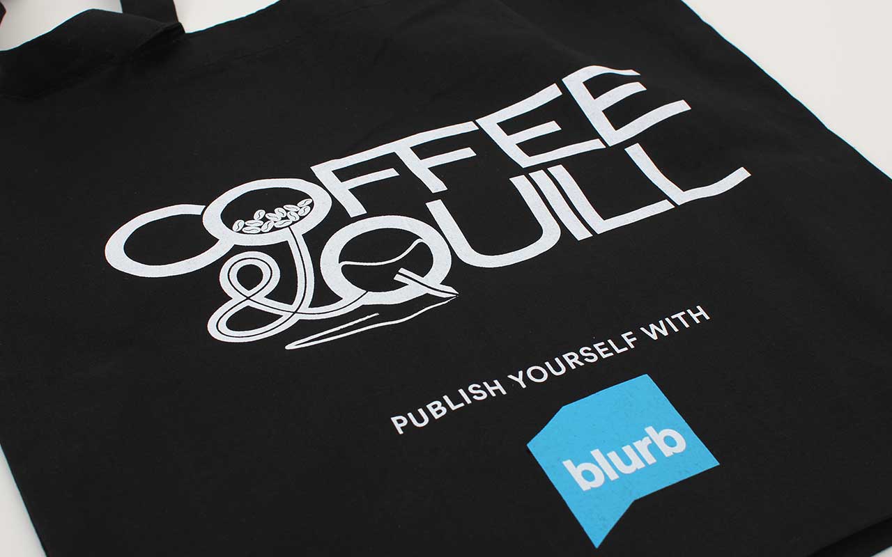
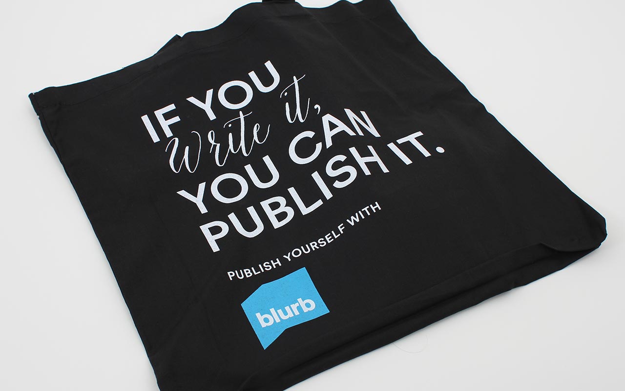
Blurb wanted to partner with Nanowrimo (National Novel Writing Month) to encourage both it’s users to enter, and Nano participants to think about making their finished Novels with Blurb. The group was named “Coffee and Quill” and newsletters and totebag giveaways were sent out to keep people motivated.
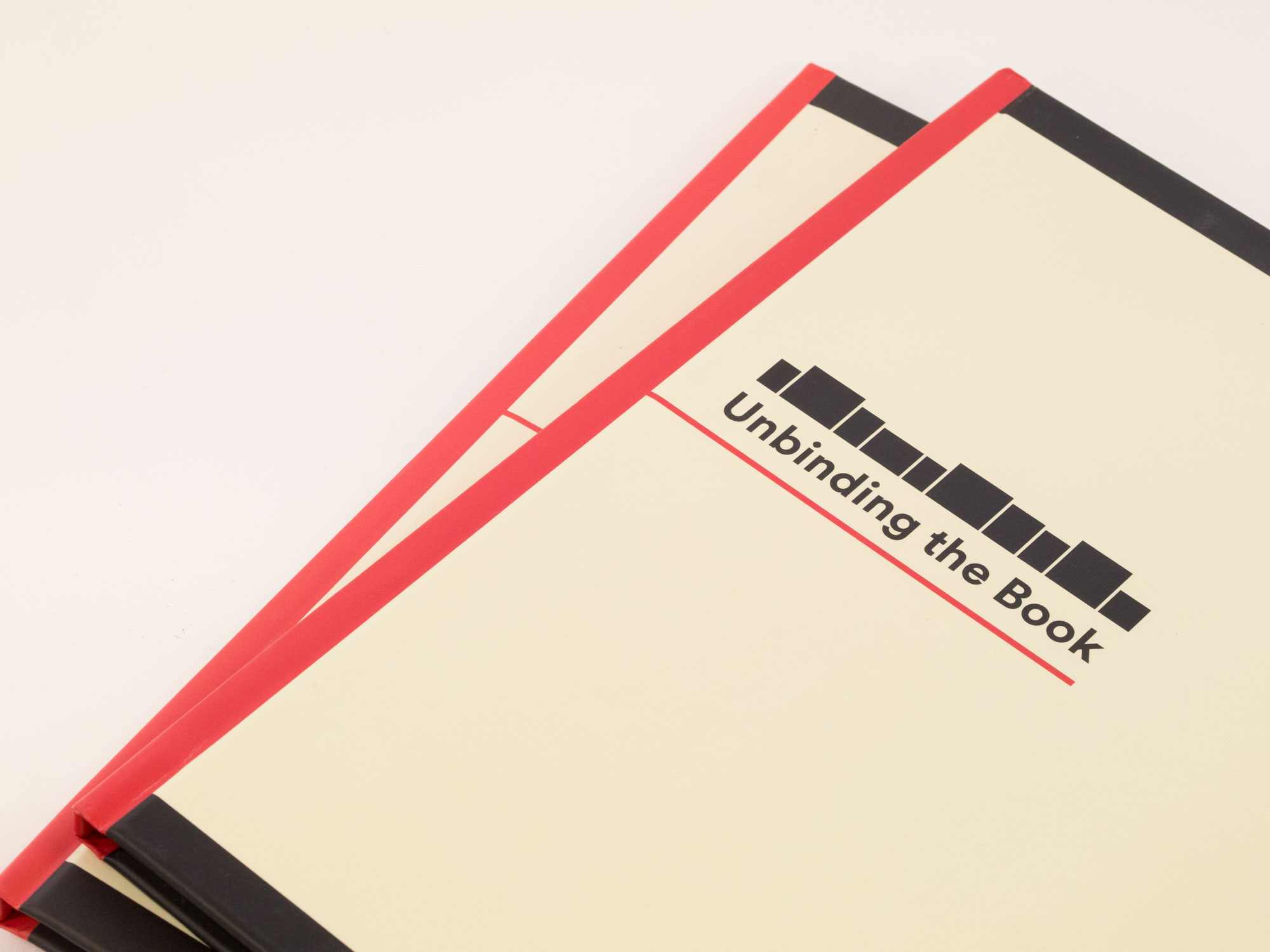
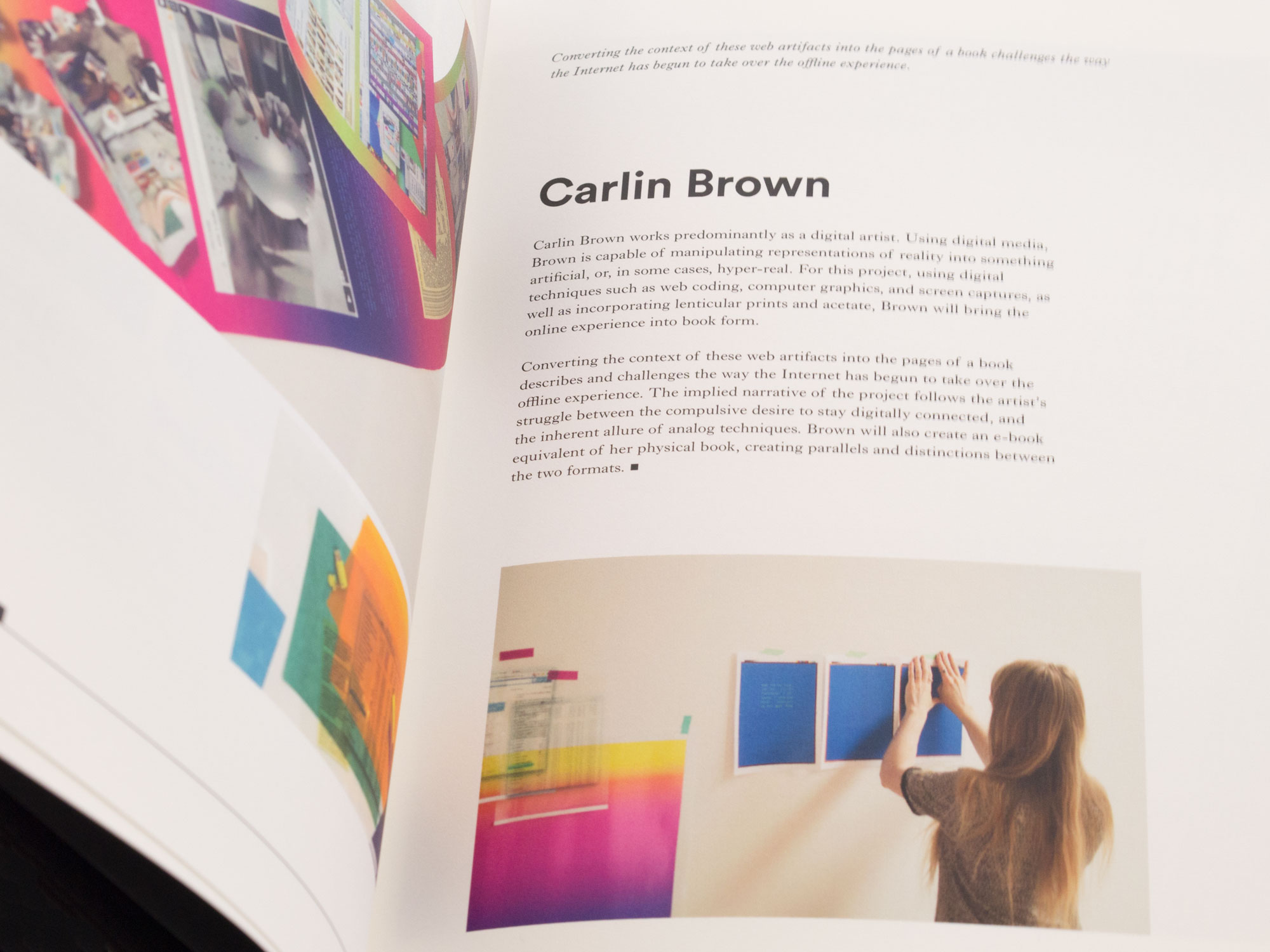
“Unbinding the Book” catalogue
Blurb wanted to make their presence at the London Art book fair, and, working with Jotta, commissioned an exhibition of artists deconstructing the book. I created a hardback book to accompany the exhibition, based on the identity developed by Jotta.
“Create a Book” notebook
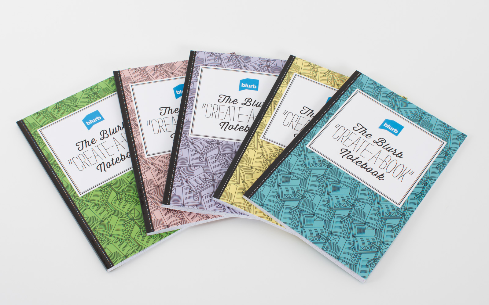
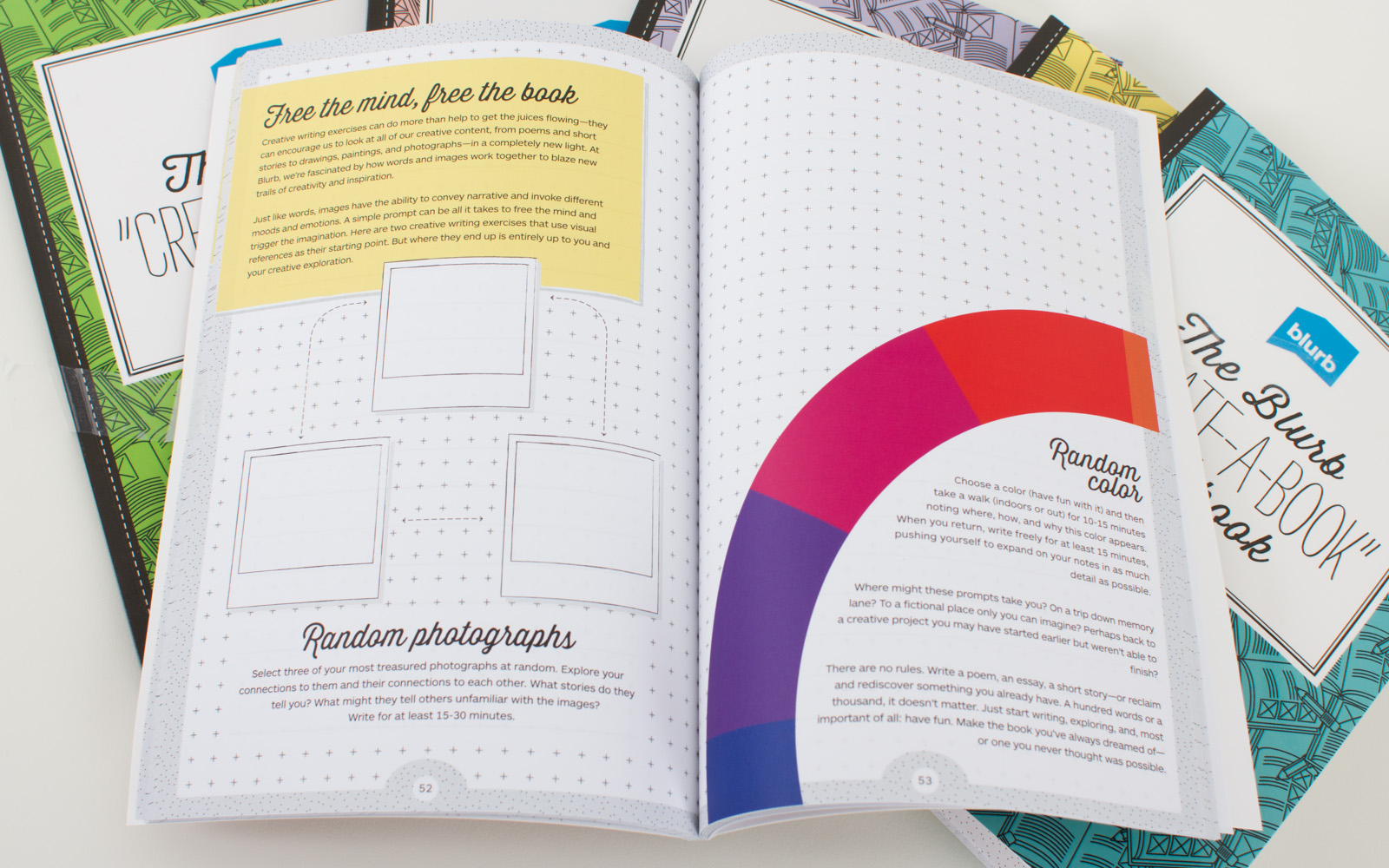
For a pop-up at Selfridges, Blurb wanted to gain consumer awareness of their offerings, whilst selling gift credit. As it was holiday season, it was decided that there should also be a low-cost offering in addition to the higher-value gift vouchers. I proposed this notebook as a starting point into the world of Blurb, with gridded blank sheets for ideas, and short exercises spread through it. A number of cover colour options were offered.
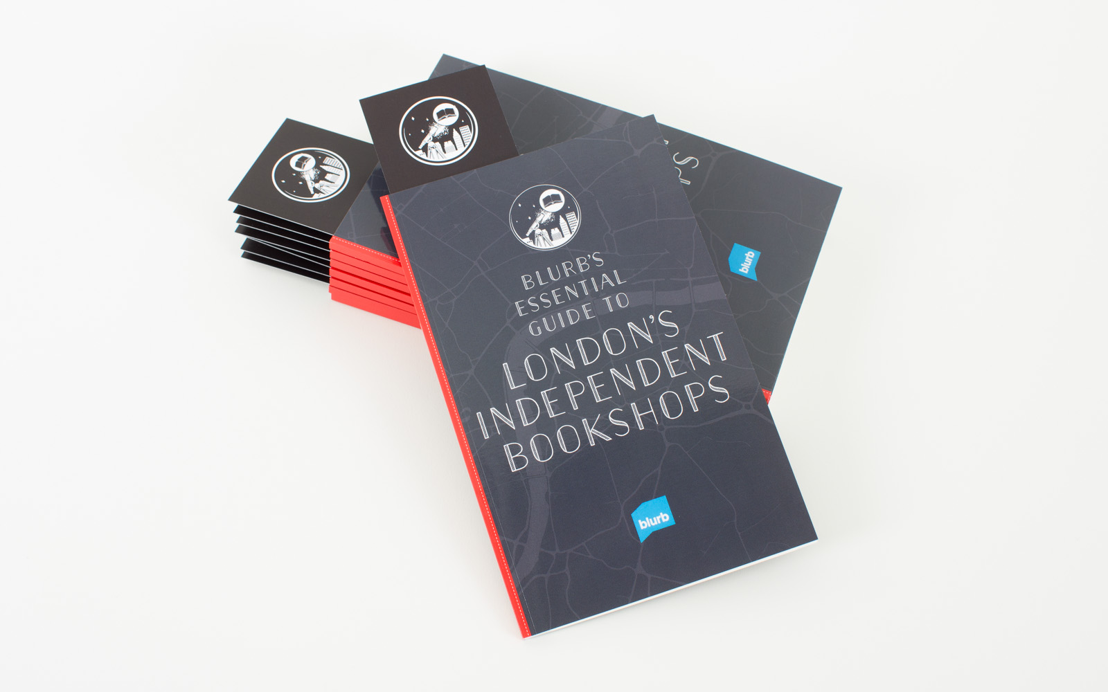
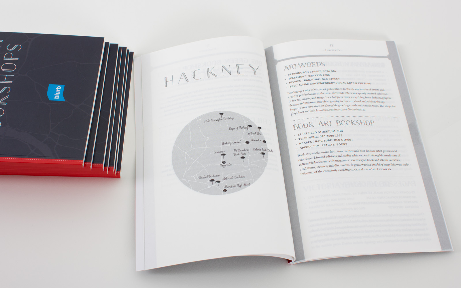
London Independent Bookshop Guidebook
Wishing to create more engagement between Blurb’s UK community of self-publishers and traditional bookshops, Blurb hosted a night at the Dover Street Arts Club. This book, produced in InDesign, and printed using Blurb was a giveaway at the event.
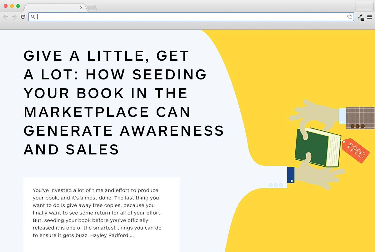
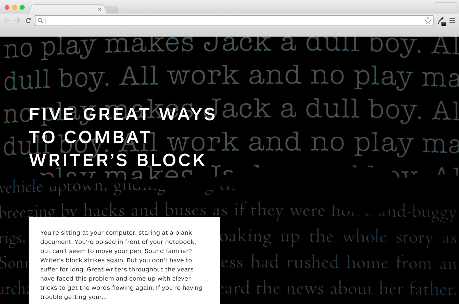
Blurb Stories editorial illustrations
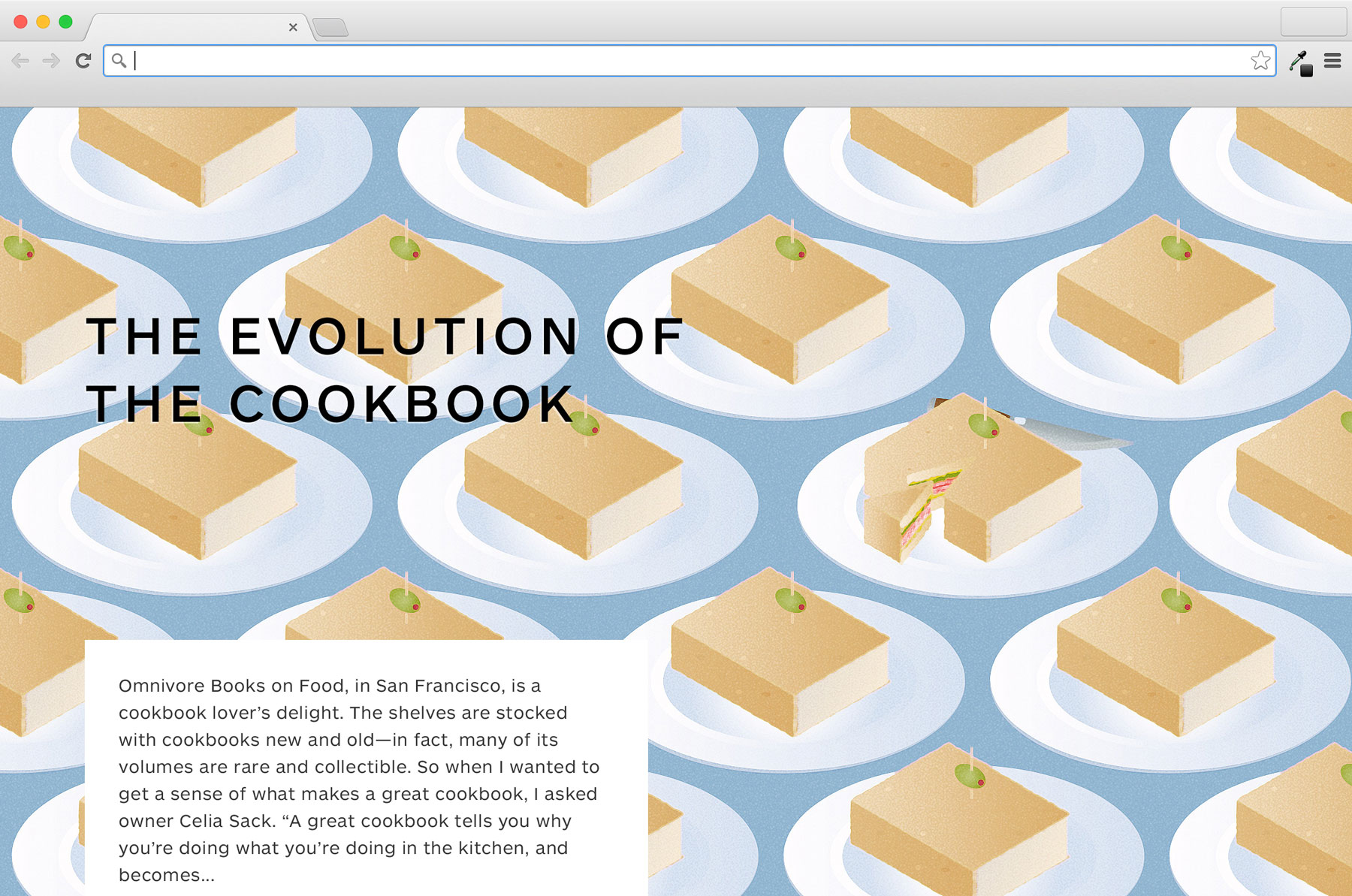
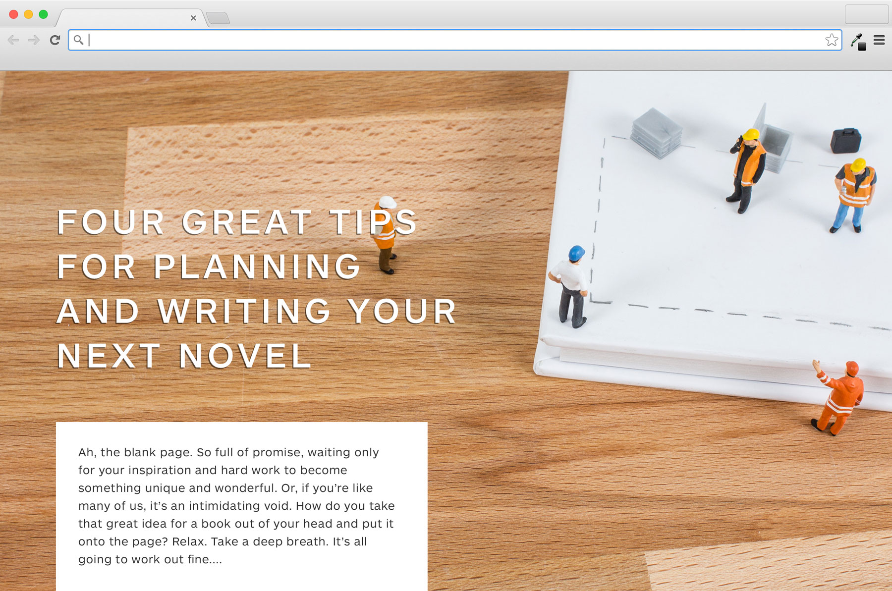
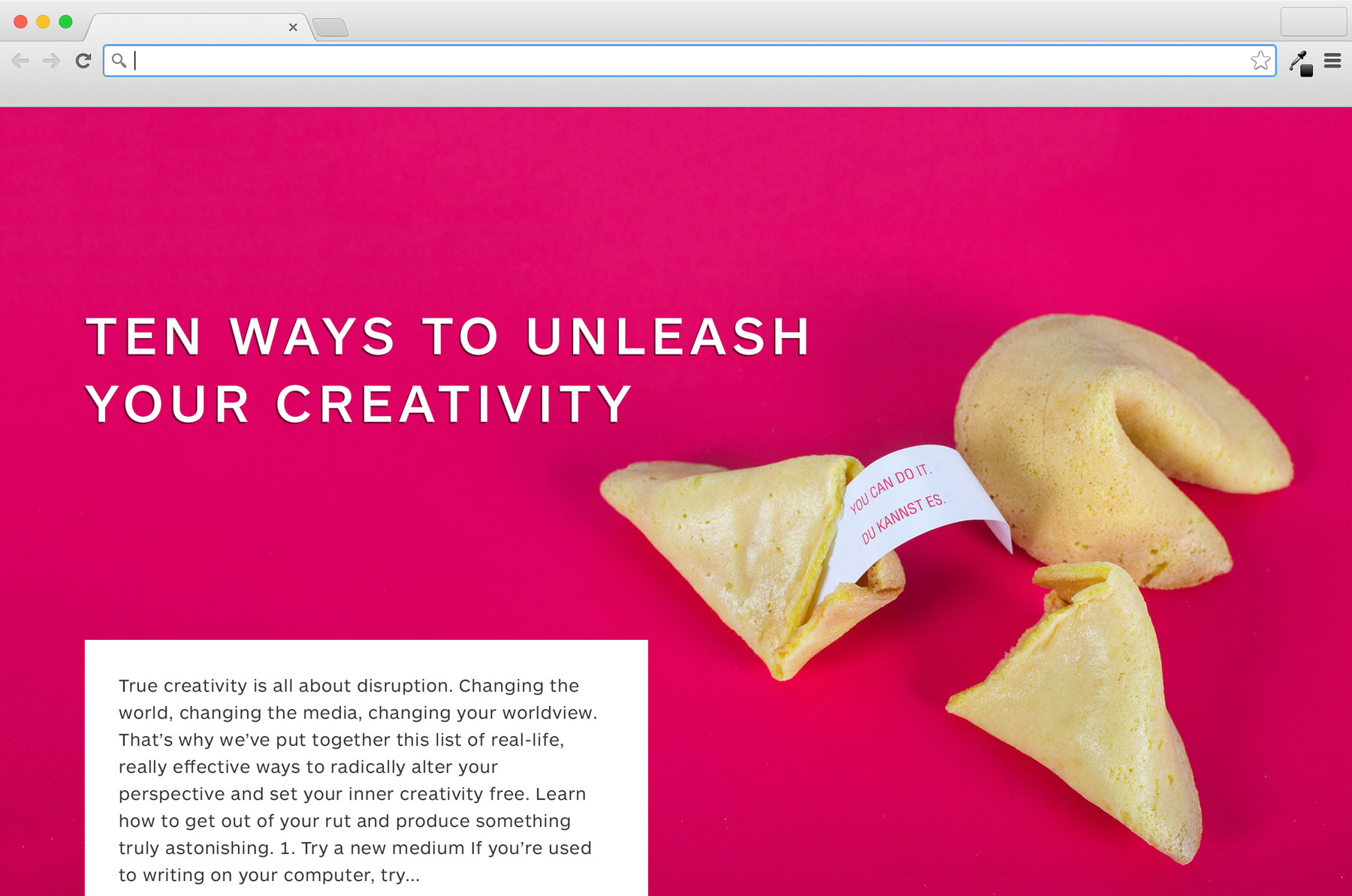
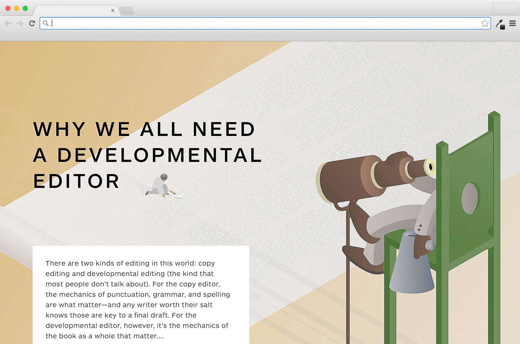
In the second half of 2014, I was responsible for the art direction and production of all imagery for the Blurb Stories blog. This necessitated creating illustrations that worked with the fully responsive site layout and allowed for the title to float over the top. I tried consciously to vary the style and approach from week to week to suggest the kind of roster of editorial illustrators that a traditional publication might carry.
London Author Fair stand
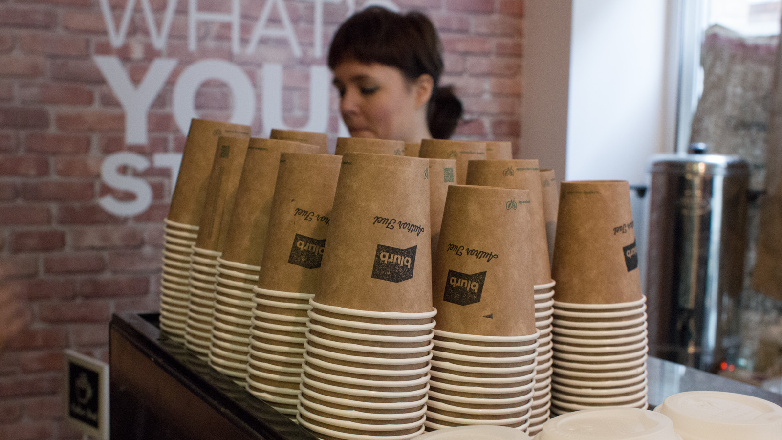
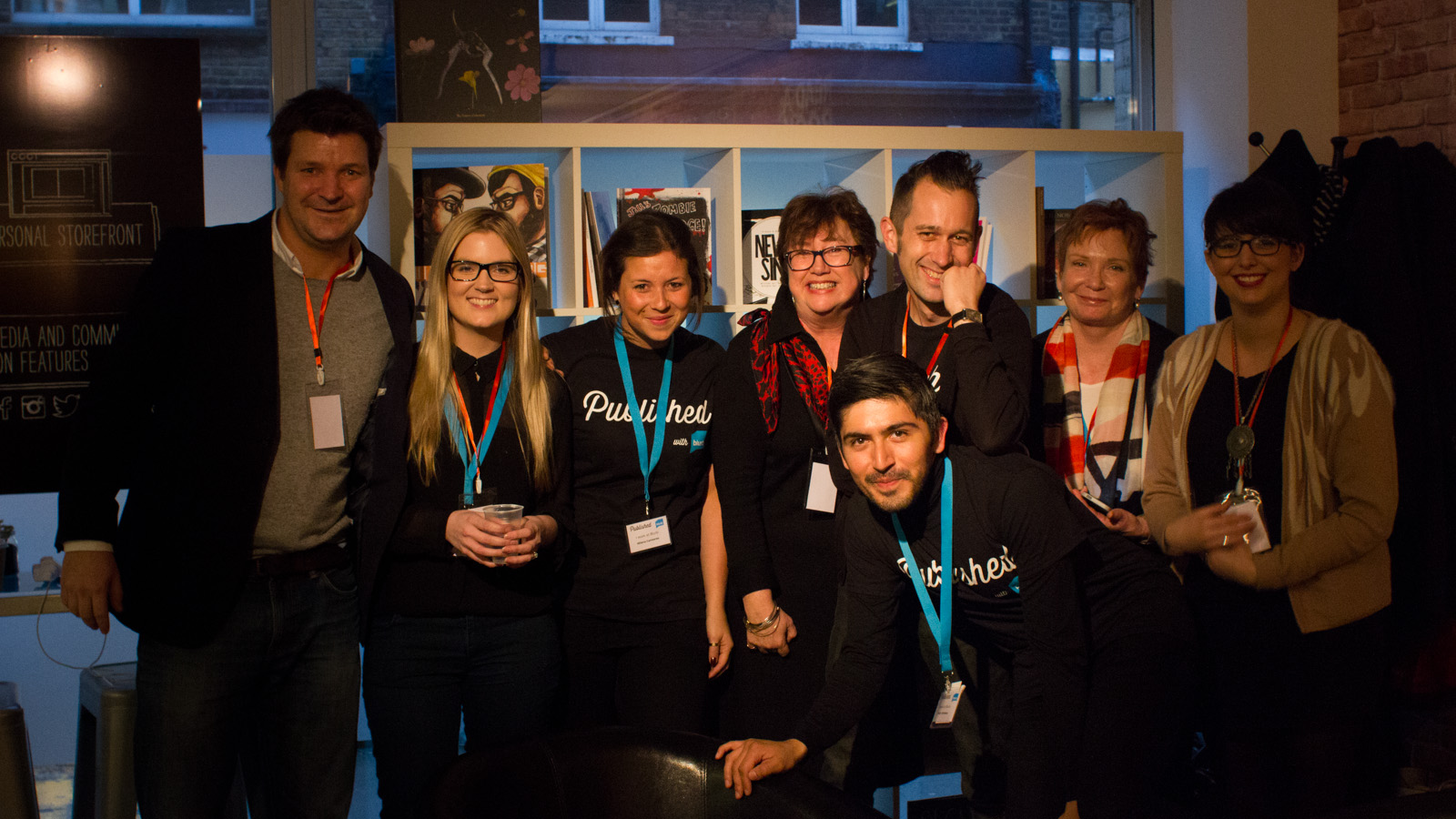
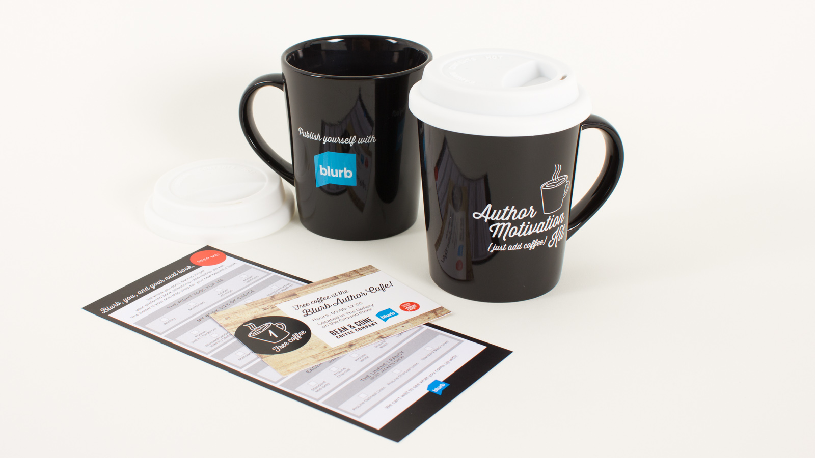
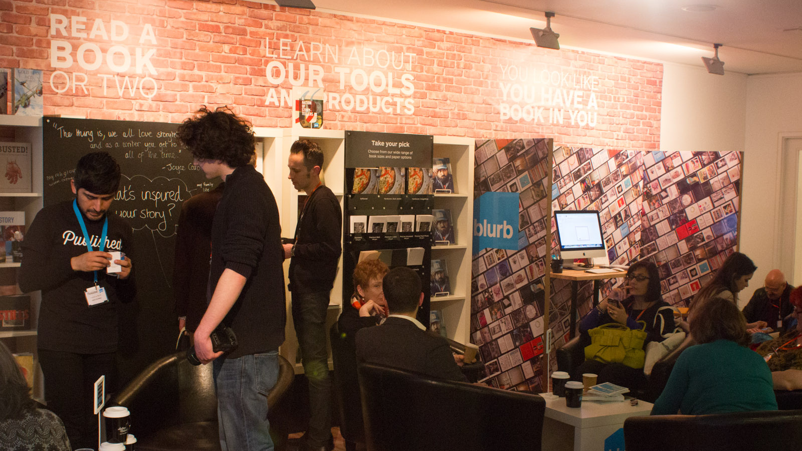
Seeking to re-position itself into the Self-publishing space – Blurb wanted to have a considerable presence at the London Author Fair in February 2014. As such the idea was to take care of the coffee concession – bringing in good baristas and providing a space for attendees to relax whilst surrounded with our product. Sheridan’s took care of the design of the event space, I designed the artwork for all panels, as well as printed giveaways and even T Shirts for our staff.
