Listing Pages
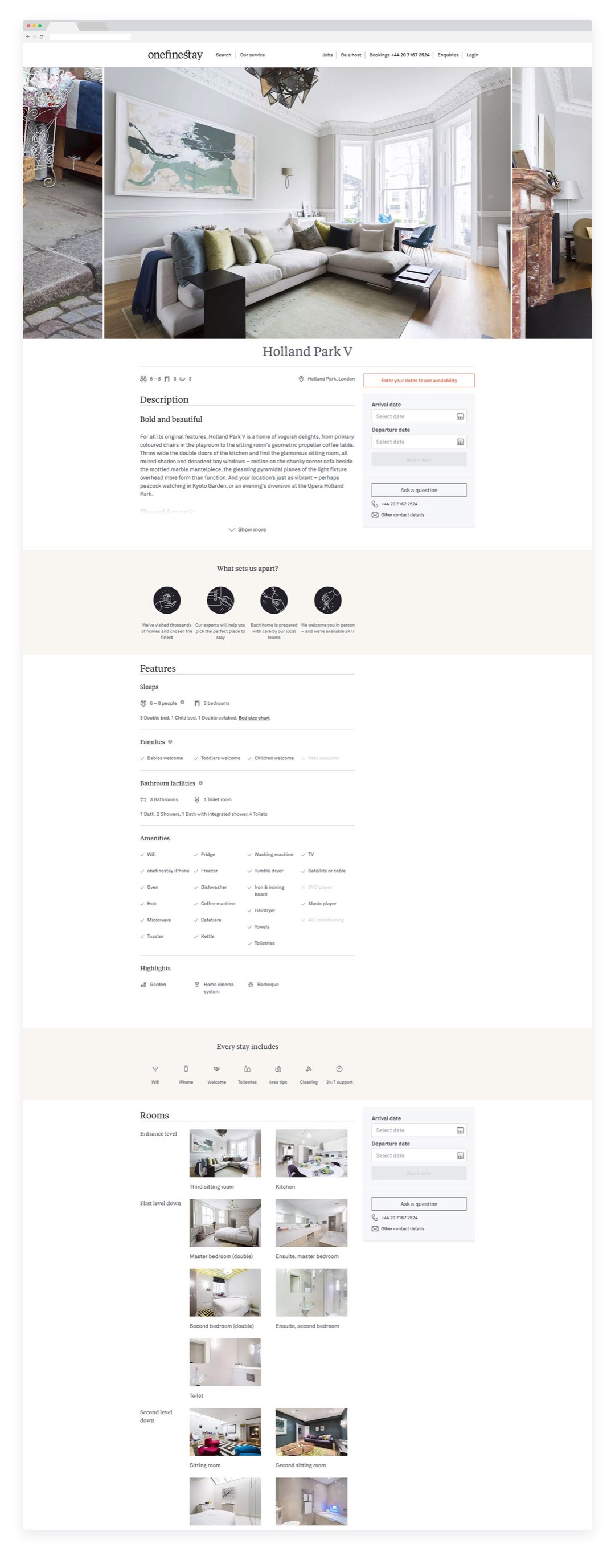
We kicked off the rework with a concentrated look at the House listing pages, which needed to both visually inspire, and contain a lot of detailed information, that the user could dive into whilst keeping the onward journey close to hand
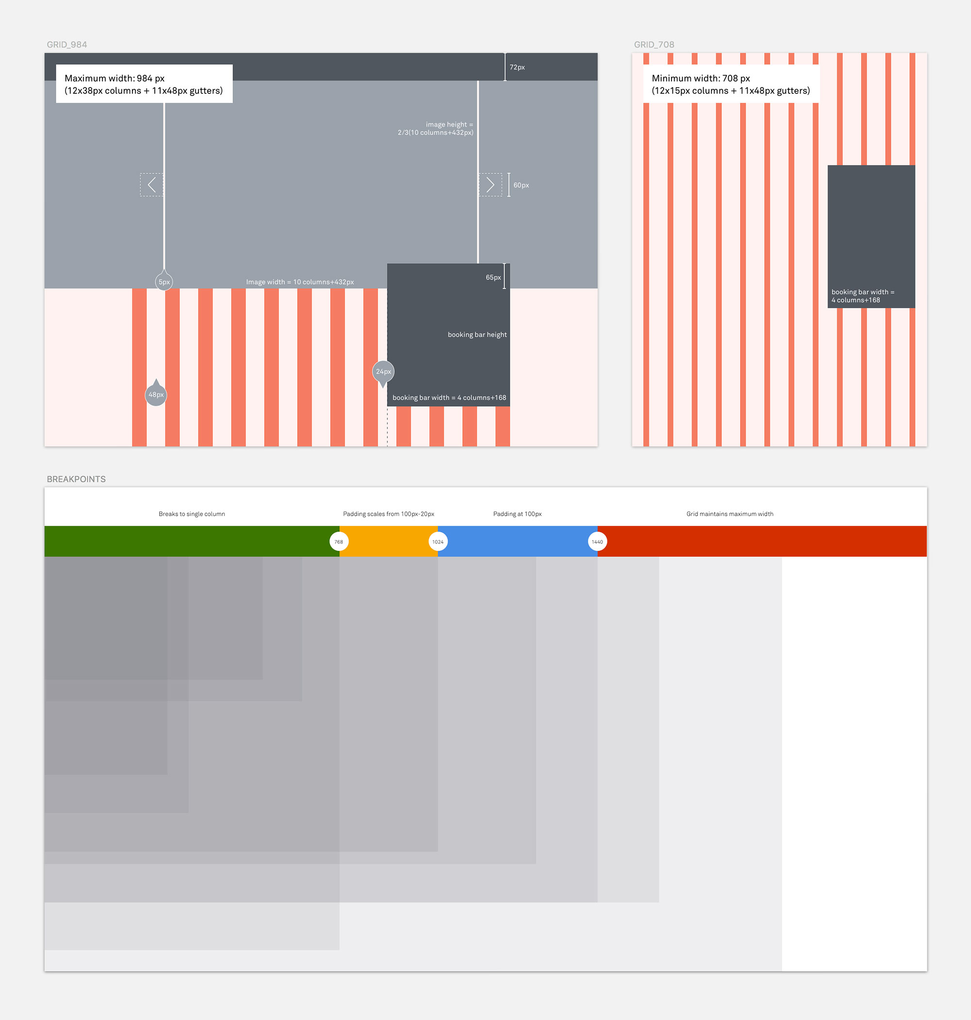
Content Strategy
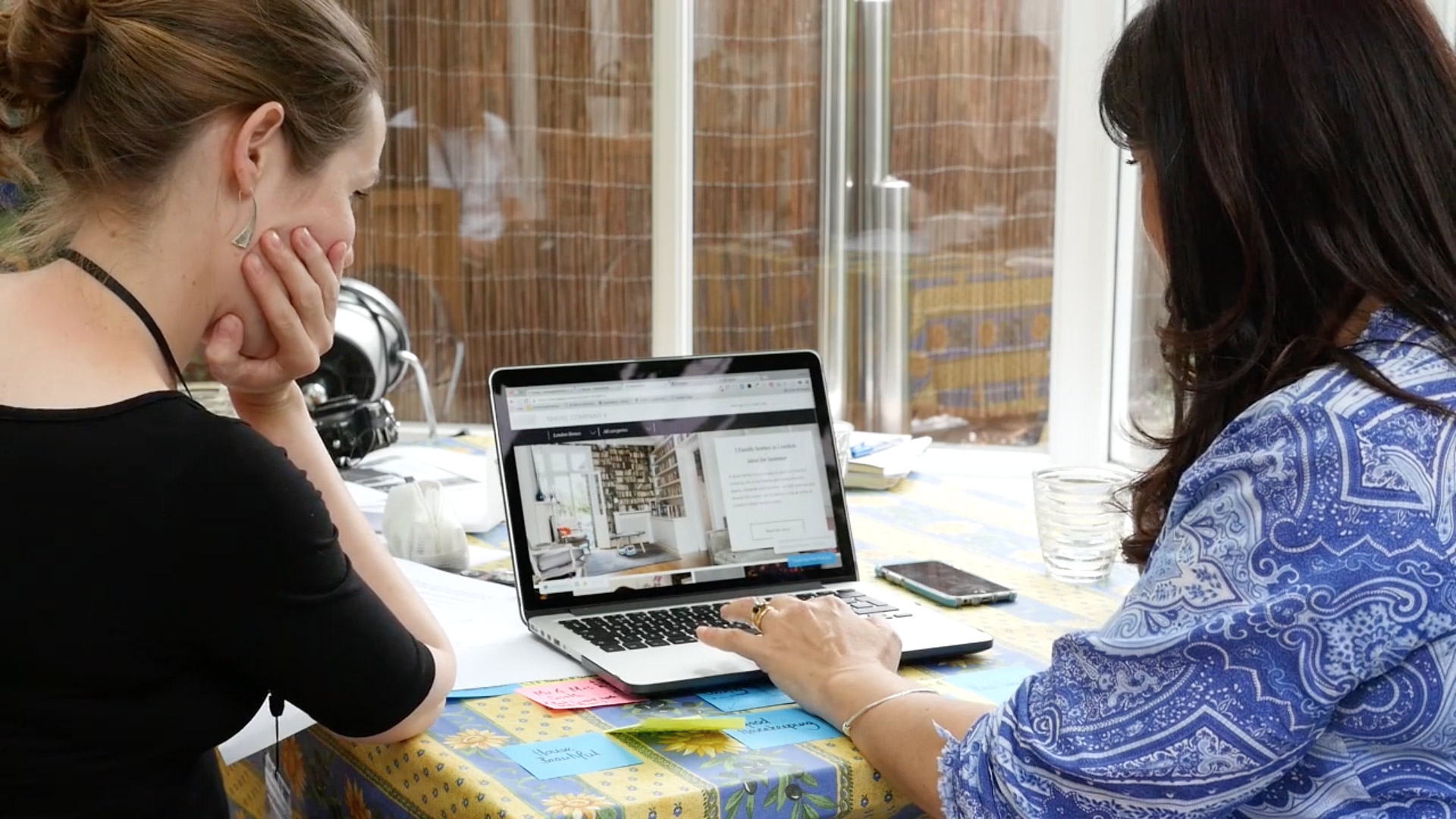
We conducted an extensive pre-design investigation, conducting workshops with various departments of the business, including brand, sales and customer service. We then produced prototypes of three extremely different website paradigms, to take to the board level for discussion on what the website could be. These were then shown in video interviews with individuals matching our desired customer profile for feedback.
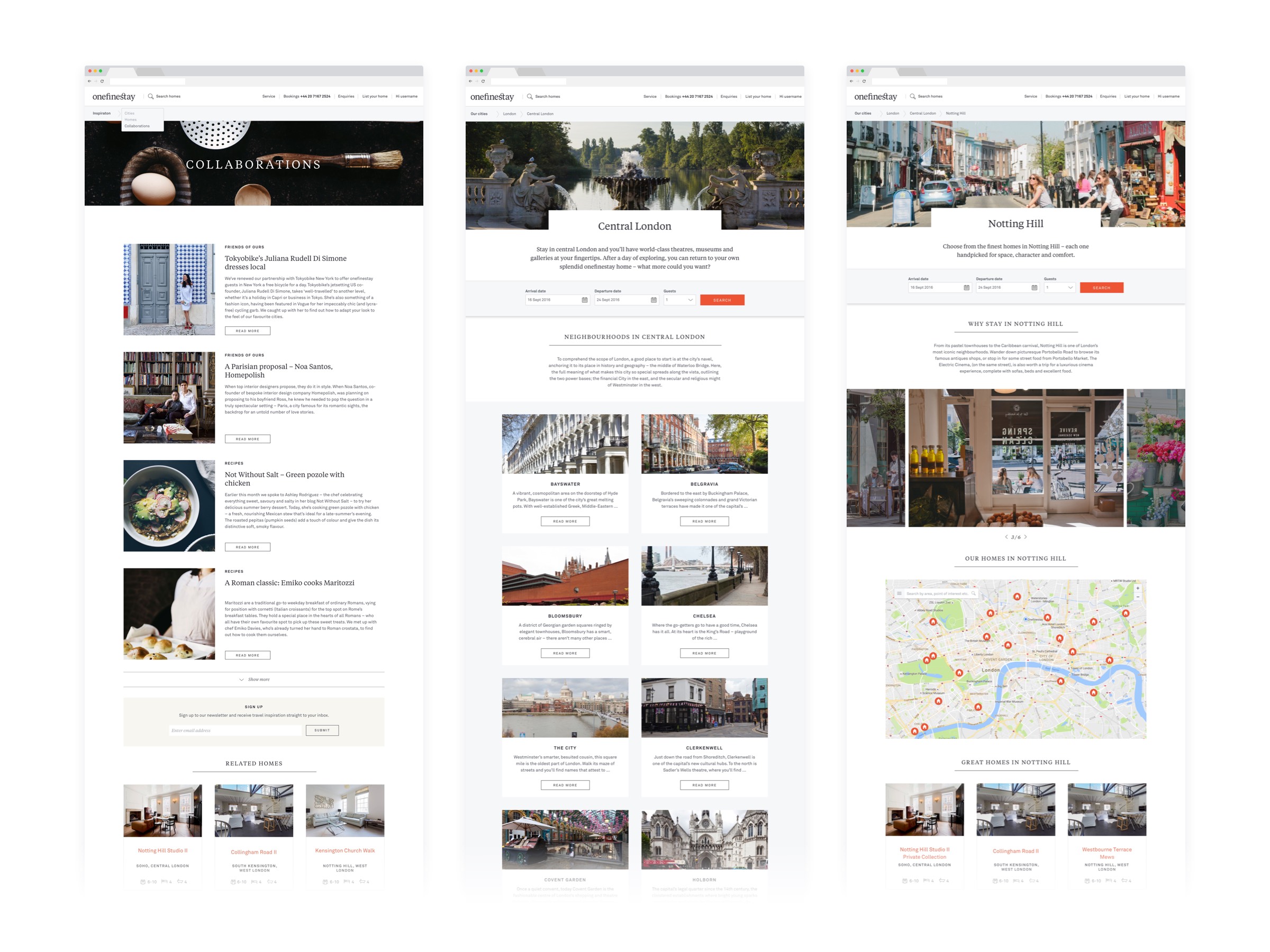
With confidence in the route we wanted to take, we then pushed the inspirational content, which had lived separately in a blog to the front and centre of the users first touchpoint with the site. This allowed the business to show off it’s knowledge and great taste to new visitors whilst merchandising its inventory in an effective and editorialised way.
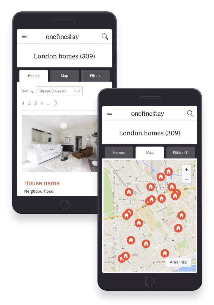
Map Search
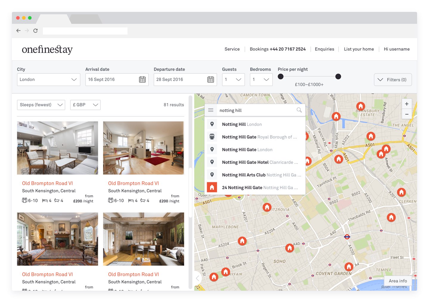
Working with Snowdrop (Google Maps professional services team) to add map search to the listings type search page, requiring a complex interplay between listings and map view, and a UI which integrates the widget with the surrounding search and filter architecture.
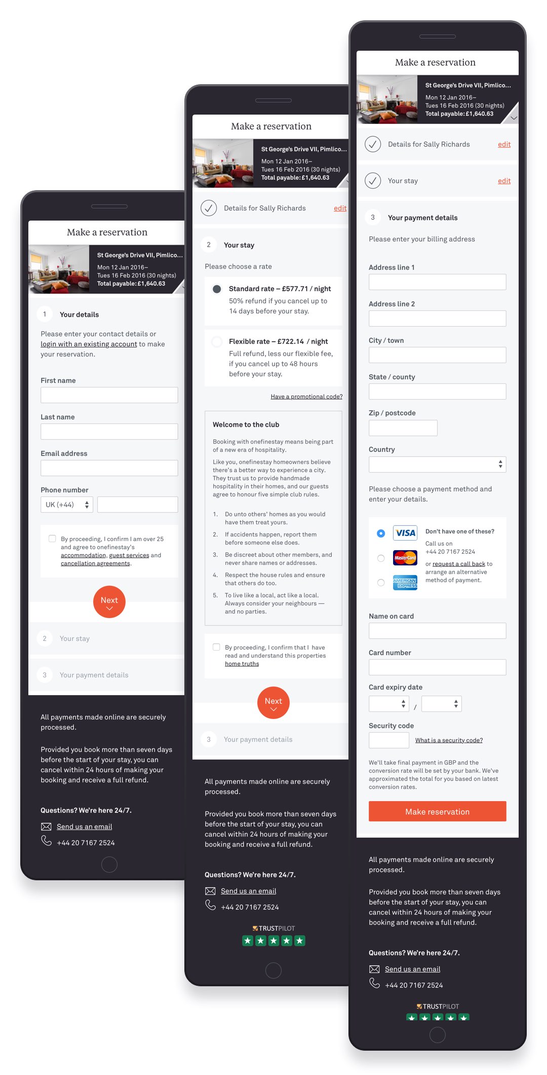
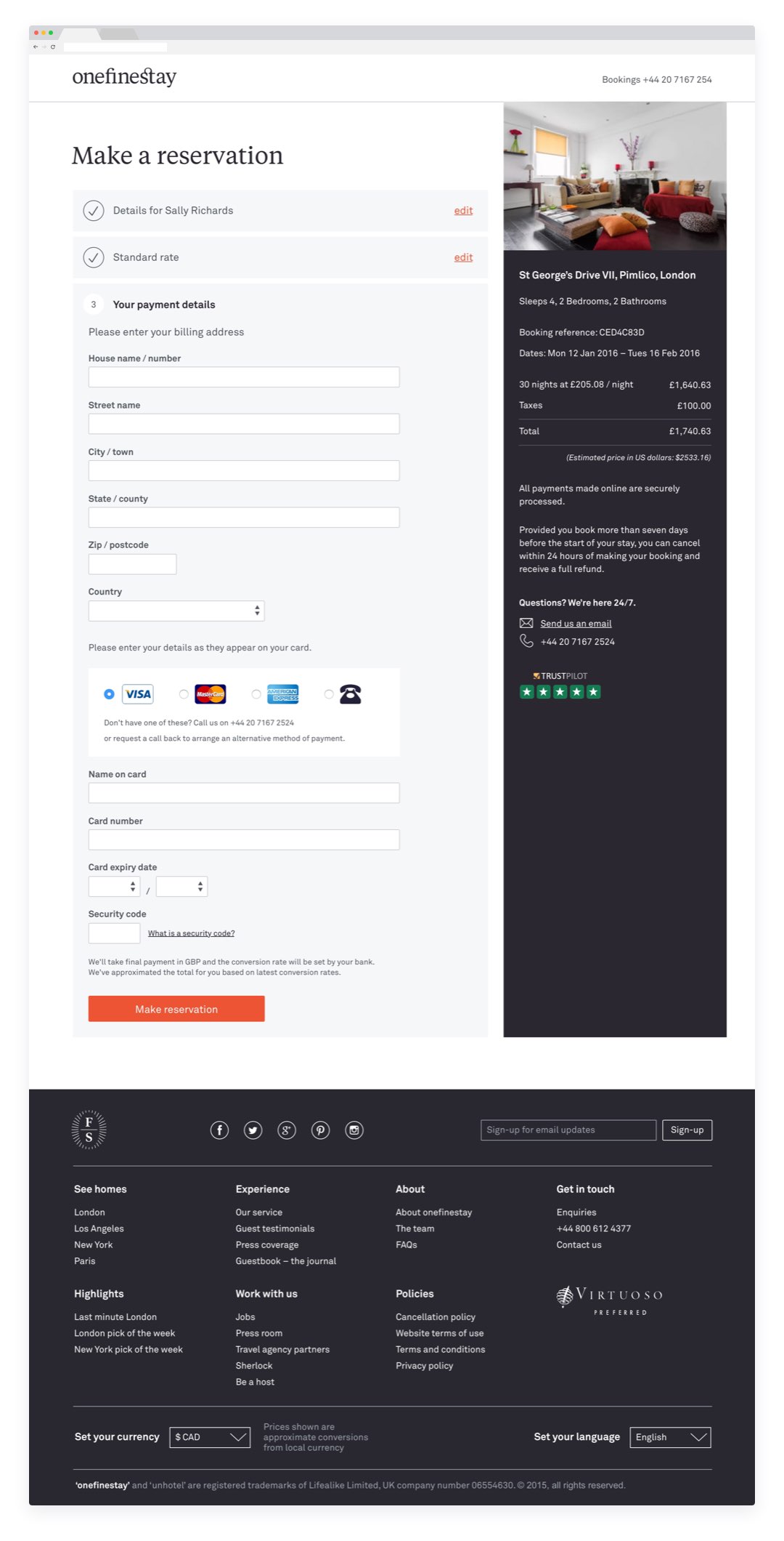
Checkout
A full redesign of the checkout process, making the process logical, clearly indicating progress and shifting away from an upfront, forced registration.
This increased checkout conversion by +87%.
