Soho House
I worked with Soho House through 2021 on the UX of the member connectivity features of their iOS and Android apps.
I worked with Soho House through 2021 on the UX of the member connectivity features of their iOS and Android apps.

Multiple lockdowns understandably posed challenges for a hospitality business, and Soho House wanted to maintain the ability for their members to connect with other members throughout. When I joined, the prospects for opening up were more optimistic, and we were able to look at building on some of the newer connectivity features of the app in a way that enhanced the members real life interactions
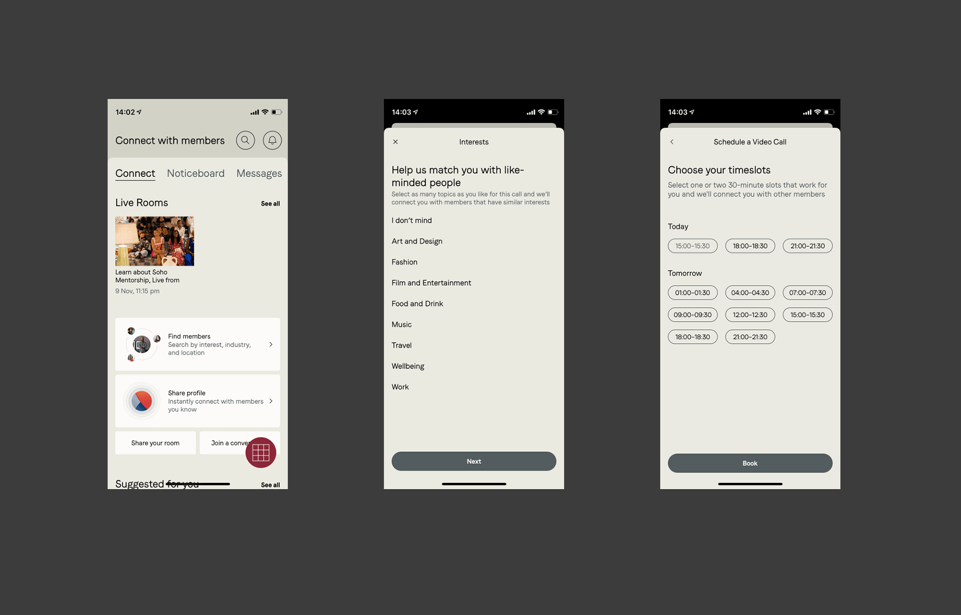
The first feature released to the app, prior to my starting was a the ability to join a scheduled video call, based around a shared topic, with 3 other members. Observations of the usage of this gave us a good starting point from which to investigate to what extent this gave members something of value to them, and what they might actually want instead to enhance their membership
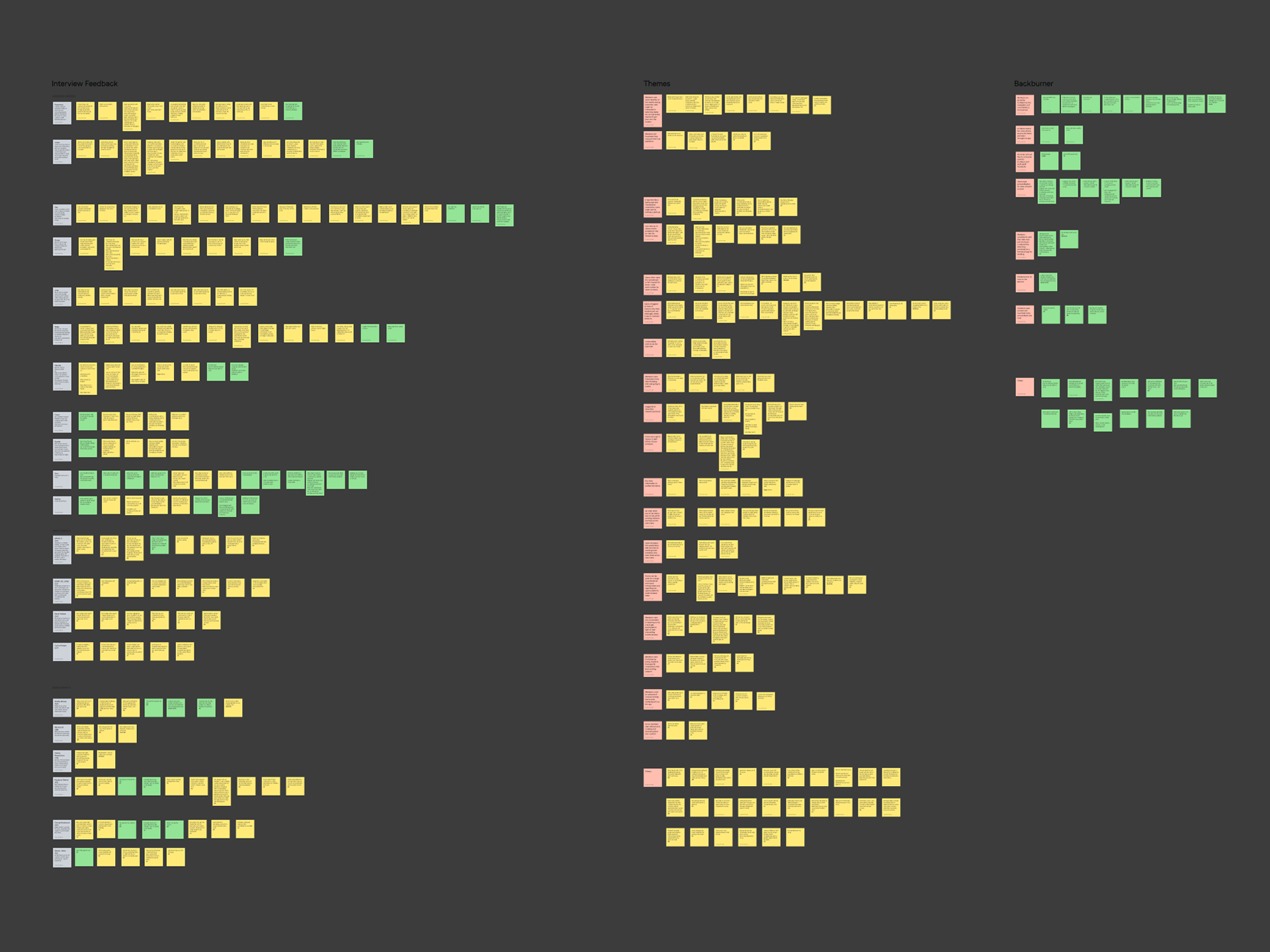
Extensive interviews with members revealed that overwhelmingly, the biggest value add would be to see who was around when they were inside the houses – to make new connections and see which of their connections were in the often large venues.

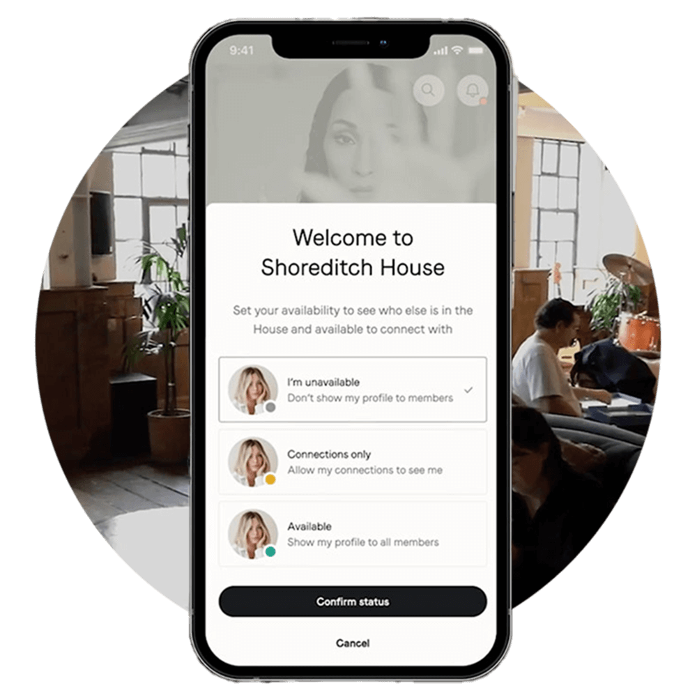
We used design workshop sessions with the whole team to turn the user needs we had prioritised to find features that would answer these needs. The one we moved forward into development was the ability to check in as a member, and view, and be visible by other users who had checked in. We ran early prototypes through user testing to validate comprehension and usability, and through use of a very well constructed Figma component library, were quickly able to turn wireframes into designs ready for development.
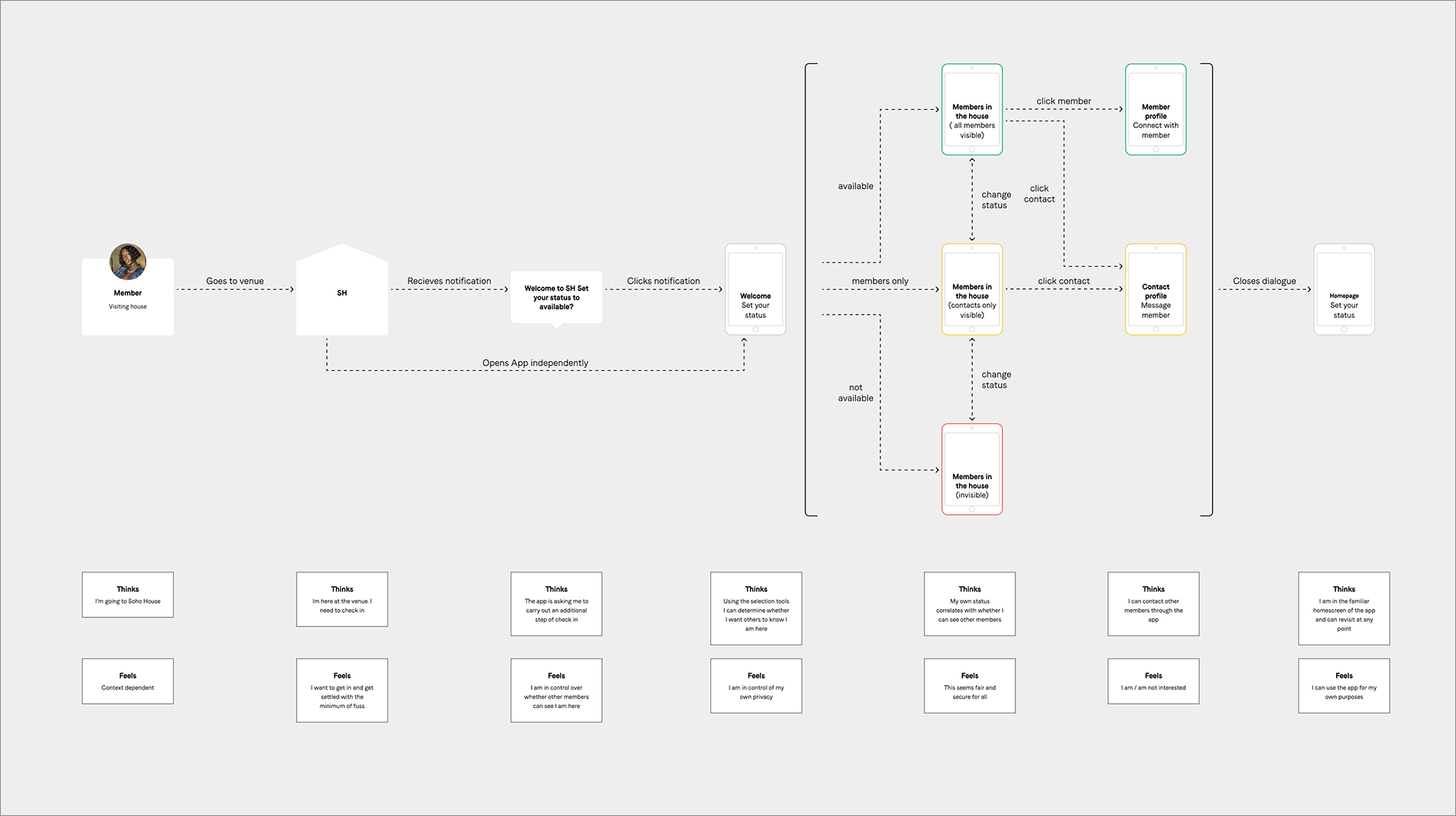
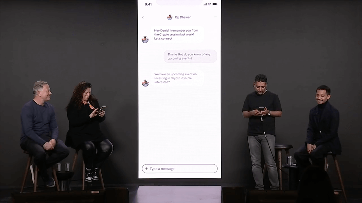
The feature was launched in a global townhall meeting presented by the CTO. It has become a popular and well used feature and continues to be optimised and developed as the core of the member digital connectivity experience.
